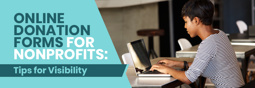
Online Donation Forms for Nonprofits: Tips for Visibility
Online giving is more popular than ever. In fact, overall nonprofit revenue from online giving increased by over 32% in the last year alone. For this reason, it’s crucial that nonprofits like yours have a seamless online giving process.
So how can you ensure that your donors have a great user experience when giving to your nonprofit online? It’s easy: create a fantastic donation form. An easy-to-use and visually-appealing donation page can make a huge difference in your online fundraising campaigns.
One of the most important aspects of your donation page is its accessibility. Your page needs to be usable by anyone who comes to your site, which means following online accessibility guidelines as well as creating an intuitive user experience.
In this brief guide, we’ll explain exactly what you need to do in order to make your donation page accessible. Here are our top tips:
- Make your donation button easy to find.
- Only ask for necessary information.
- Use your form to build your brand.
- Optimize your form for mobile devices.
You’ve put in a lot of effort to drive supporters to your donation form, so it’s crucial that the design is optimized for encouraging donations. With a few simple steps, you can have an effective and easily accessible donation page. Let’s dive in!
1. Make your online donation button easy to find.
The last thing you want is for an eager donor to arrive at your site only to be unable to find where they should donate. However, you can avoid this online fundraising challenge by making your donation button prominent and easy to find. To create an effective donation button, you should:
- Feature the button prominently: Your first step to creating an accessible donation button is to make it easy to spot on your website. Most organizations tend to put their button in the upper right corner of their website. This way, visitors see it as soon as they navigate to your website. Be sure to write something like, “Donate Now” on your button so that visitors know exactly how to get to your donation page.
- Include your donation button on relevant pages and blog posts: In addition to featuring your donation button on your home page, it’s also a good idea to include a donation option on other relevant pages and blog posts on your site. Although you don’t want to overwhelm donors with requests for donations, they will likely feel inspired to donate by some of your content, so make it easy for them to follow through!
- Share your button across other platforms: To encourage more donations across your other online platforms, be sure to share your donation button across different virtual channels, like social media and email. Create one design and maintain consistency across all platforms to build recognition among your supporters.
Fortunately, nonprofits have a lot of online tools they can choose from to make these tips a reality. This Donately guide on online fundraising tools provides a comprehensive list of the very best tools nonprofits can use so that every donor can find what they’re looking for, such as wealth screening tools or fundraising progress monitors.
2. Only ask for necessary information on your online donation form.
Let’s face it: your donors all lead busy lives. And while they may have the best intentions when going to make their donation on your website, it’s easy for them to become distracted. The risk for form abandonment is especially high when you have a long donation form, which can slow down the entire giving process.
Rather than requiring your donors to fill out a super long form, only ask them to fill out necessary information. This is what you should ask on your donation form:
- Name
- Contact information
- Payment information
- Matching gift eligibility
- Interest in other engagement opportunities (ensure this question is optional)
This information should be all that you need in order to effectively process the donation. By only asking for the necessities, you can streamline the donation process, making it so that anyone has the time to quickly fill out the form.
Ideally, you can engage the donor in other ways after the donation is completed. For example, you could email a survey after the donation to ask the donor to tell you a bit more about themselves to help you plan for more effective fundraising in the future. While you may not get as many participants, you won’t risk losing out on a donation because your donation form asks too many questions.
Overall, keeping your donation form on the shorter side will make supporting your organization accessible to anyone, no matter how busy they might be.
3. Use your nonprofit’s online donation form to build your brand.
Social media has completely changed the way that nonprofits engage with their supporters. Nonprofits must develop a brand for themselves to build recognition and help supporters feel connected to their cause. But your brand shouldn’t just stop at social media — it should extend to every aspect of your nonprofit’s work, including your donation page.
Creating a branded donation page is essential to build trust among your supporters. The last thing you want is for a dedicated supporter to navigate to your website to donate, only to find a blank donation page that doesn’t seem to be connected to your organization. The donor might abandon their task because they don’t feel comfortable sharing their financial information with an unbranded site.
For this reason, be sure to brand your donation page to your organization. Include your logo, typography, and color scheme to reassure your donors that they are in the right place. However, don’t overdo it! Tons of graphics or videos could be distracting. In other words, show off your brand, but not too much.
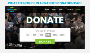
Additionally, Getting Attention’s nonprofit branding strategy guide emphasizes the importance of maintaining consistent branding across multiple platforms. With consistent branding, you can build trust among your supporters. If they’re familiar with your brand on social media or in your email newsletter, then they’ll instantly recognize your donation page.
And to make sure your branding is even more accessible online, be sure to follow digital best practices, like including alt text on images and ensuring there is a high enough contrast between text and background so that visually impaired readers can still learn about your nonprofit!
4. Optimize your online donation form for mobile devices.
Did you know that 51% of people who visit a nonprofit’s website do so from their mobile device? And 25% of online donations are made from a mobile device? And those numbers only continue to grow!
If you want to make your donation form accessible to all audiences, users must be able to access and fill out your form from their mobile devices.
Making your donation form and website accessible on a mobile device is also beneficial to rank highly on search engines. Here are some best practices that you can follow to ensure that your site is optimized for mobile usage:
- Ensure images load correctly on a smaller screen: Let’s say you’ve created an amazing graphic for your website that outlines exactly how your donations are used. You want to make sure every visitor can see it! When uploading the image, be sure that it is legible on a smaller screen. You can verify this by running a Lighthouse Report on your website and selecting the mobile view.
- Adjust font size: Have you ever clicked on a website link on your mobile device and found that the font was way too big or way too small? Resolve this issue by adapting your website for a mobile view so that visitors don’t need to zoom way in or way out in order to read your donation instructions.
- Check that the page loads quickly: When it comes to loading speed, many of us get impatient when a page takes too long. Be sure to run a diagnostic test on your website to make sure that your donation page loads as fast as possible so that donors can quickly contribute.
These quick fixes can make all the difference with your online donation process. Not only will your donors be able to access your form on the go, but they will also have a positive user experience because you’ve optimized their interaction. Donors will appreciate being able to easily connect with your nonprofit rather than have to spend time fighting with your website.
Accessibility is a vital aspect of online usage, and it should definitely be a high priority for your donation page. The more accessible your form is, the more likely that you can expand your audience and generate more revenue. Plus, every supporter will feel as though you’ve kept their needs in mind while building your form. Good luck, and happy fundraising!